@opensaas/stack-ui
Composable React UI components for building admin interfaces with Stack. Built on top of shadcn/ui primitives with full TypeScript support and multiple levels of abstraction.
Overview
The UI package provides everything you need to build admin interfaces, from complete out-of-the-box solutions to low-level primitives for custom UIs:
- AdminUI - Complete admin interface with routing, navigation, and CRUD operations
- Standalone Components - Drop-in components for forms, tables, and common UI patterns
- Field Components - Individual field inputs with validation and type safety
- Primitives - Low-level shadcn/ui components for building custom interfaces
Installation
pnpm add @opensaas/stack-ui
The UI package has peer dependencies on @opensaas/stack-core, next, react, and react-dom.
Quick Start
Full Admin Interface
The simplest way to add an admin interface to your Next.js app:
// app/admin/[[...admin]]/page.tsx
import { AdminUI } from '@opensaas/stack-ui'
import type { ServerActionInput } from '@opensaas/stack-ui/server'
import { getContext, config } from '@/.opensaas/context'
import { getSession } from '@/lib/auth'
import { redirect } from 'next/navigation'
import { getUrlKey } from '@opensaas/stack-core'
import '@opensaas/stack-ui/styles'

async function serverAction(props: ServerActionInput) {
  'use server'
  const session = await getSession()
  const context = await getContext(session ?? undefined)
  const result = await context.serverAction(props)
  if (result && typeof result === 'object' && 'success' in result && result.success) {
    redirect(`/admin/${getUrlKey(props.listKey)}`)
  }
  return result
}

interface AdminPageProps {
  params: Promise<{ admin?: string[] }>
  searchParams: Promise<{ [key: string]: string | string[] | undefined }>
}

export default async function AdminPage({ params, searchParams }: AdminPageProps) {
  const resolvedParams = await params
  const resolvedSearchParams = await searchParams
  const session = await getSession()
  if (!session) {
    return <div>You must be signed in to access the admin interface.</div>
  }
  return (
    <AdminUI
      context={await getContext(session)}
      config={await config}
      params={resolvedParams.admin}
      searchParams={resolvedSearchParams}
      basePath="/admin"
      serverAction={serverAction}
    />
  )
}
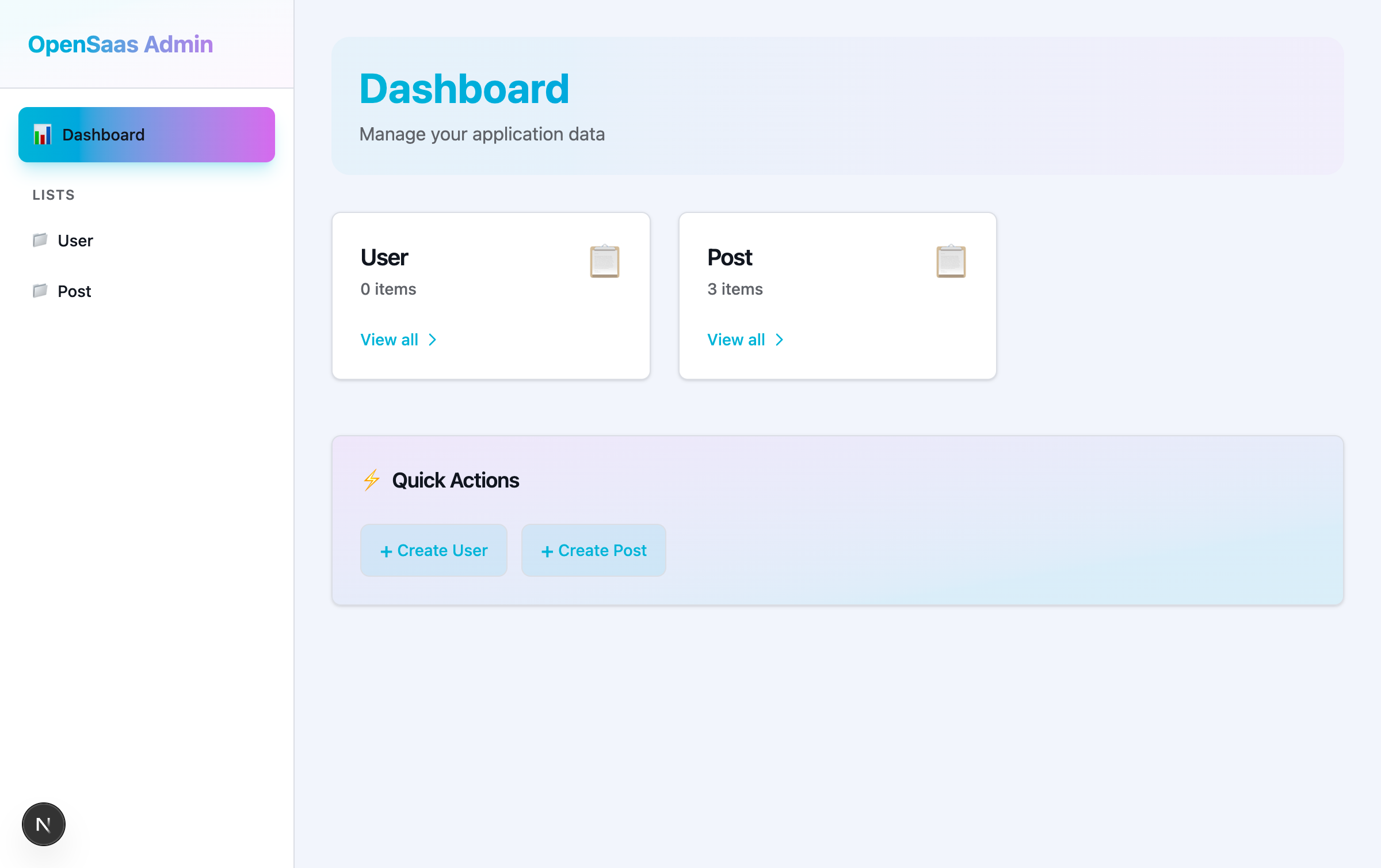
This gives you a complete admin interface with:
- Dashboard with list summaries and quick actions
- List views with search, sorting, and pagination
- Create and edit forms with validation
- Delete confirmation dialogs
- Responsive navigation sidebar
Package Exports
The UI package uses multiple export paths for different levels of abstraction:
// Main export - Full admin UI and utilities
import { AdminUI, registerFieldComponent } from '@opensaas/stack-ui'

// Primitives - shadcn/ui components
import { Button, Card, Input, Table } from '@opensaas/stack-ui/primitives'

// Field components - Individual field inputs
import { TextField, SelectField, RelationshipField } from '@opensaas/stack-ui/fields'

// Standalone components - Composable CRUD components
import { ItemCreateForm, ItemEditForm, ListTable } from '@opensaas/stack-ui/standalone'

// Server utilities - Type imports for server actions
import type { ServerActionInput } from '@opensaas/stack-ui/server'

// Styles - Tailwind CSS
import '@opensaas/stack-ui/styles'
Core Components
AdminUI
The AdminUI component provides a complete admin interface with routing, navigation, and CRUD operations.
import { AdminUI } from '@opensaas/stack-ui'
import type { ServerActionInput } from '@opensaas/stack-ui/server'
import { getContext, config } from '@/.opensaas/context'
import { getSession } from '@/lib/auth'

async function serverAction(props: ServerActionInput) {
  'use server'
  const session = await getSession()
  const context = await getContext(session ?? undefined)
  return context.serverAction(props)
}

export default async function AdminPage() {
  const session = await getSession()
  return (
    <AdminUI
      context={await getContext(session ?? undefined)}
      config={await config}
      serverAction={serverAction}
    />
  )
}
Props:
context- Access-controlled context from.opensaas/contextconfig- OpenSaas configuration objectserverAction-'use server'wrapper aroundcontext.serverActionfor mutationsnavigation?- Replaces the built-in sidebar wholesale (see Admin chrome slot below)navItems?- Adds host-supplied links to the built-in sidebar (see below); ignored whennavigationis also supplied
Features:
- Automatic routing based on URL segments
- Navigation sidebar with list links
- Dashboard with list summaries
- List views with search and sorting
- Create and edit forms
- Delete confirmations
Admin chrome slot and navItems
When AdminUI is mounted at a sub-path alongside a host application's own navigation, the built-in sidebar has no link back out. Two props address this (ADR-0021):
navItems — the smallest change, for adding one or more links to the built-in sidebar. Each item renders as a NavLink after the Lists and Settings groups, above the footer:
<AdminUI
  context={context}
  config={config}
  serverAction={serverAction}
  navItems={[{ label: 'Back to App', href: '/', icon: <HomeIcon className="h-4 w-4" /> }]}
/>
navigation — replaces the sidebar wholesale with any React node, for hosts building their own chrome entirely. AdminUI still owns routing, the per-route Suspense skeletons, and theme compilation; the supplied node owns its own width/height like the built-in sidebar does. When navigation is supplied, AdminUI skips resolveNavCounts — host-owned chrome resolves its own access-scoped counts (it's already exported for this):
import { NavLink, deriveCurrentPath } from '@opensaas/stack-ui'
import { resolveNavCounts } from '@opensaas/stack-core'

const currentPath = deriveCurrentPath(params.admin)
const navCounts = await resolveNavCounts(context, config)

<AdminUI
  context={context}
  config={config}
  serverAction={serverAction}
  navigation={
    <nav className="w-64 border-r p-4">
      <NavLink href="/" icon={<HomeIcon className="h-4 w-4" />}>Back to App</NavLink>
      <NavLink href="/admin/post" active={currentPath.startsWith('/post')} count={navCounts.Post}>
        Posts
      </NavLink>
    </nav>
  }
/>
If both navigation and navItems are supplied, navigation wins and navItems is ignored, with a development-only console warning.
NavLink (importable from @opensaas/stack-ui) is the same component the built-in sidebar uses, so host-supplied entries render identically — same active-state fill, icon box, count badge, and data-slot="nav-link" handle. Both active (default false) and icon are optional.
deriveCurrentPath(params) derives the currentPath string AdminUI computes internally from the route params array, so host-owned chrome that needs it for active-state highlighting doesn't have to re-derive the rule.
Dashboard
The dashboard shows an overview of your lists with item counts and quick actions.
Features:
- List summary cards with item counts
- "View all" links to list views
- Quick action buttons for creating items
- Responsive grid layout
ListView
The list view displays items in a table with search, sorting, and actions.
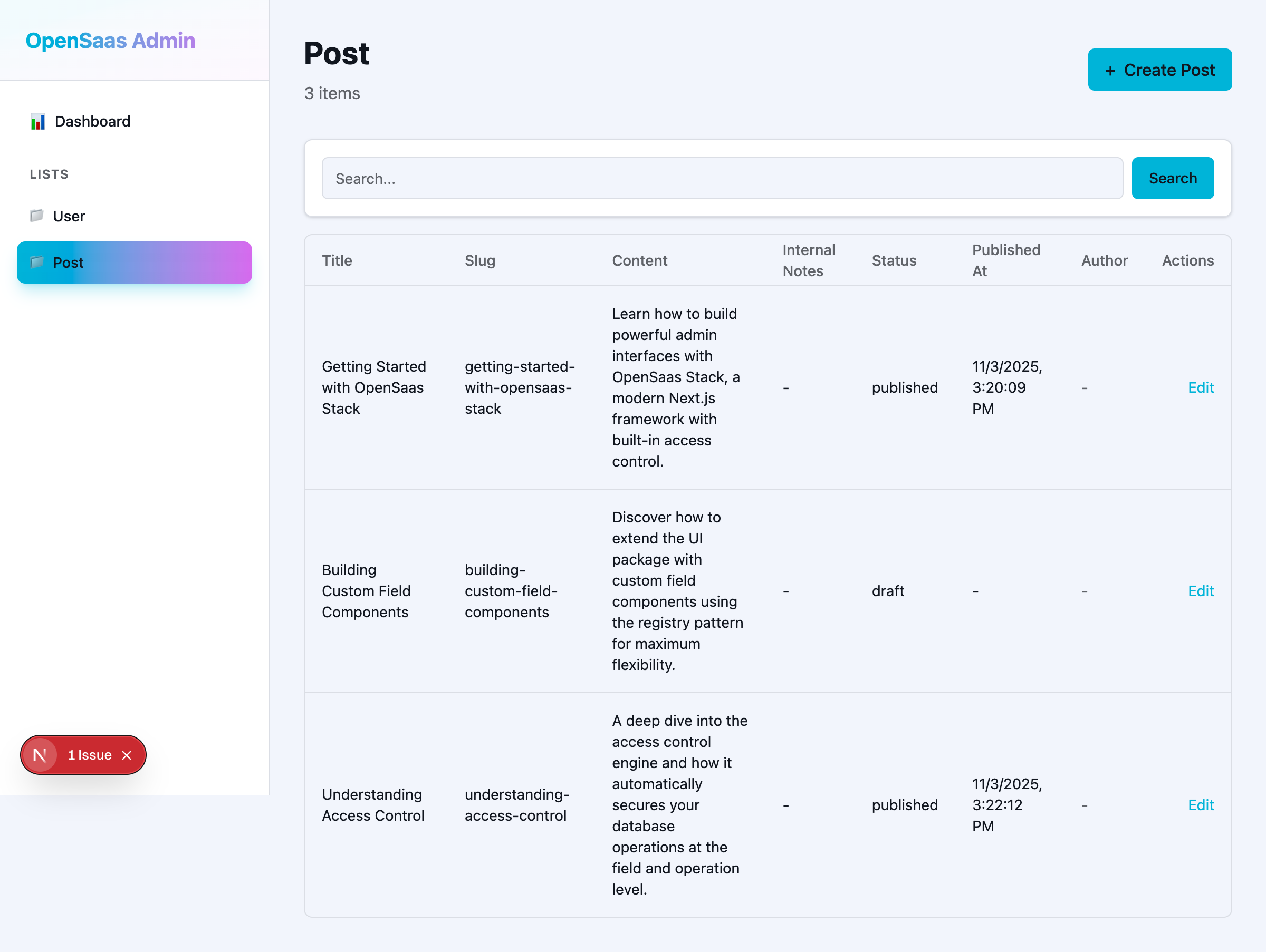
Features:
- Sortable columns
- Search functionality
- Edit and delete actions
- Pagination —
pageandpageSizeprops, defaulting to1and50. The total is the same access-scoped read counted in the database, so it can only ever equal the number of rows the session may page through. - Responsive table layout
Filtering and sorting
The list view's Filter builder and the ?search= query it serialises are one grammar. A token is field:value, optionally with a comparison (views:>100); a bare word is free text, OR-matched across every field that declares itself free-text. Tokens combine with implicit AND, and a token the list cannot honour — an unknown field, an unsupported operator, an empty value — degrades to free text rather than erroring.
Each field type declares which operators it accepts. Text fields accept eq only, and lower it to contains. Numbers, decimals, big integers and timestamps accept eq, gt, gte, lt and lte.
What filtering costs
Three consequences of lowering these filters onto the secured read's closed where vocabulary. Each is a deliberate trade, not a defect:
containsand texteqin filter URLs are case-insensitive. The vocabulary'scontainslowers toilike, and a text field'seqlowers tocontains— so?search=title:Draftalso matchesdraft. There is nomodeoption to make either case-sensitive.- A to-many count filter other than presence degrades to free text. Only three count expressions map onto a relation quantifier:
orders:0becomesnone, andorders:>0andorders:>=1both becomesome. Anything else —orders:3,orders:>=2,orders:<5— has no quantifier to lower to, so it falls through to the free-text pass. - Sorting by a to-many count is gone.
orderBytakes this list's own scalar columns; a relationship is refused. Order by a stored counter column if you need that ordering.
(ADR-0055.)
ItemForm
Forms for creating and editing items with validation and field-level access control.
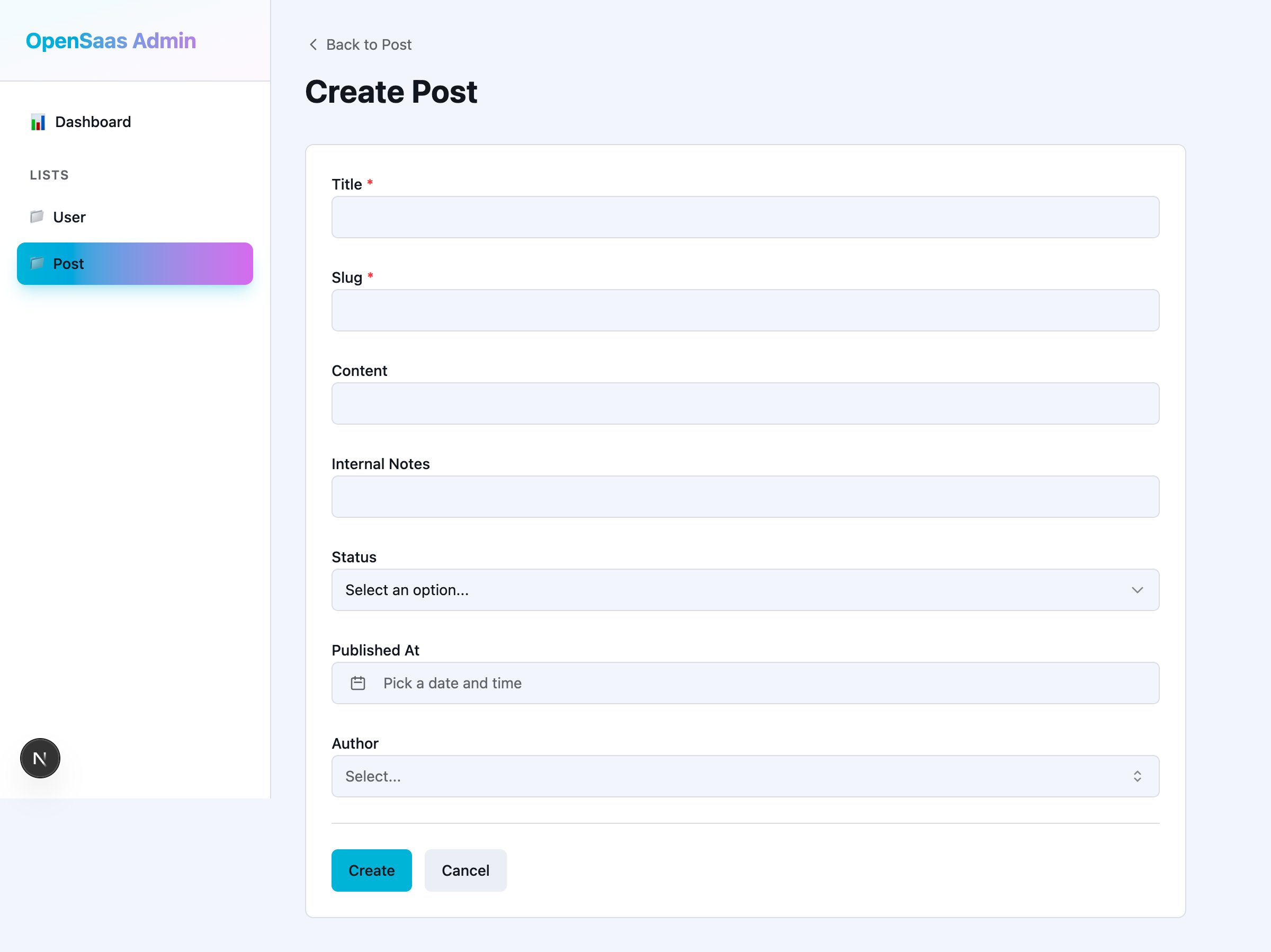
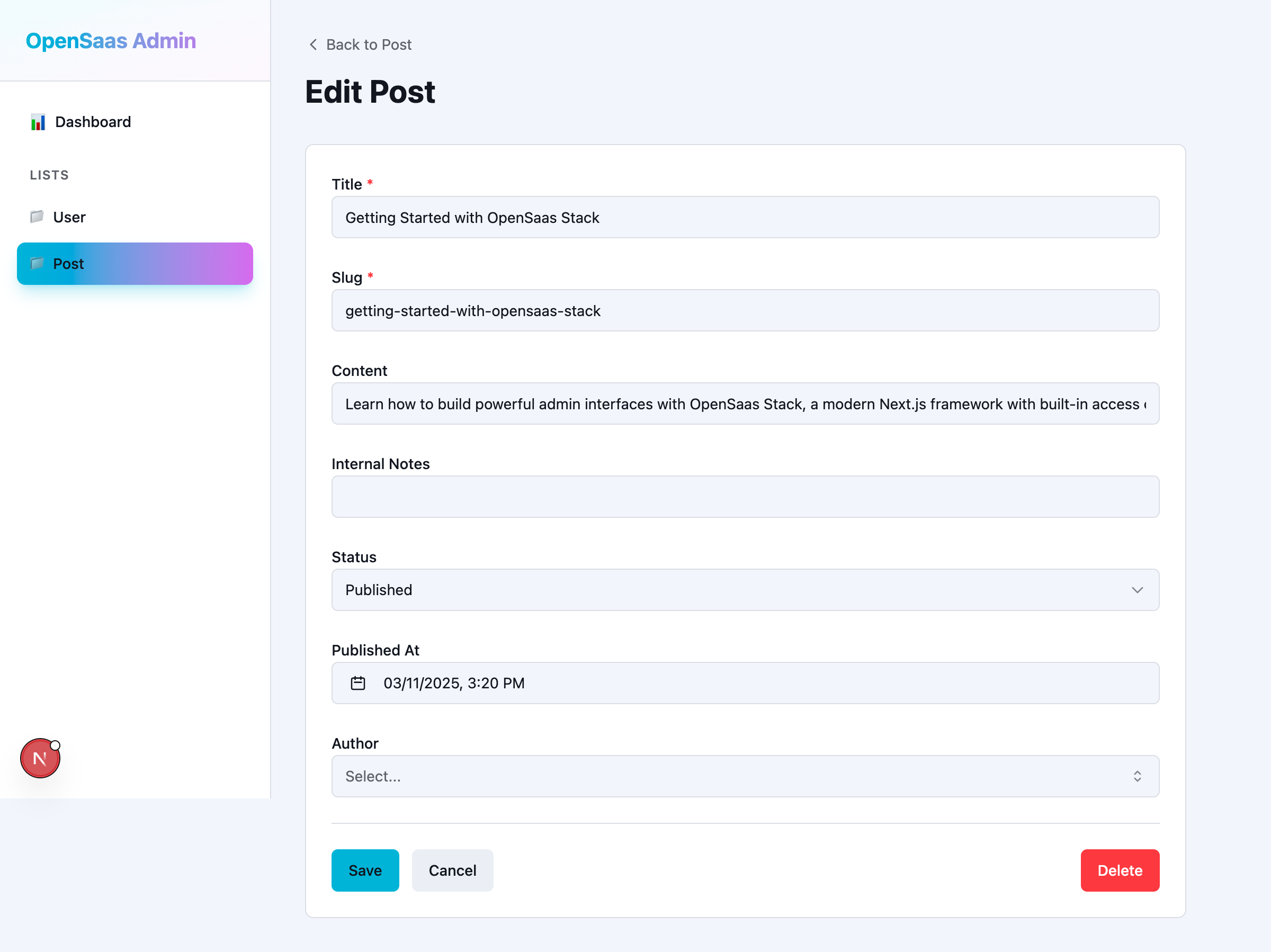
Features:
- Automatic field rendering based on field type
- Client-side and server-side validation
- Field-level access control
- Required field indicators
- Error messages
- Cancel and delete actions
Standalone Components
Standalone components allow you to build custom admin interfaces by composing individual components.
ItemCreateForm
A standalone form for creating new items.
The form renders the field configs you hand it and calls onSubmit with the collected values. It never touches the database itself — it holds no context, so the write stays on the server, where access control and hooks run. Below, the server component resolves the config, and the write is an inline server action; it works the same when the action lives in its own 'use server' module.
// app/posts/new/page.tsx
import { ItemCreateForm } from '@opensaas/stack-ui/standalone'
import { config, getContext } from '@/.opensaas/context'
import type { PostCreateInput } from '@/.opensaas/types'

export default async function CreatePostPage() {
  const resolvedConfig = await config

  async function createPost(data: PostCreateInput) {
    'use server'
    const context = await getContext()
    const post = await context.db.Post.create({ data })
    if (!post) return { success: false, error: 'Could not create the post' }
    return { success: true }
  }

  return (
    <ItemCreateForm<PostCreateInput>
      fields={resolvedConfig.lists.Post.fields}
      listKey="Post"
      config={resolvedConfig}
      onSubmit={createPost}
      submitLabel="Create Post"
    />
  )
}
create() returns null on denial as well as on failure, so the handler turns a falsy result into { success: false } rather than dereferencing it — the form renders whatever error you return.
Props:
fields- The field configs to render, keyed by field name (config.lists.Post.fields)onSubmit-(data) => Promise<{ success: boolean; error?: string }>; returningsuccess: falsekeeps the form open and showserrorlistKey?andconfig?- Supply both to have the non-owning end of a one-to-one render read-only with an explanation, the way the admin item form doesonCancel?- Called when the cancel button is pressed; the button is hidden without itrelationshipData?- Pre-fetched{ id, label }options per relationship fieldsubmitLabel?,cancelLabel?- Button textclassName?,classNames?- Root class and per-partdata-slotclass overrides
ItemEditForm
A standalone form for editing existing items.
ItemEditForm is ItemCreateForm plus initialData — the values the form opens with. There is no itemId prop and no fetching inside the component: you read the row yourself, seed the form from it, and decide what the update does.
// app/posts/[id]/page.tsx
import { notFound } from 'next/navigation'
import { ItemEditForm } from '@opensaas/stack-ui/standalone'
import { config, getContext } from '@/.opensaas/context'
import type { PostUpdateInput } from '@/.opensaas/types'

export default async function EditPostPage({ params }: { params: Promise<{ id: string }> }) {
  const { id } = await params
  const resolvedConfig = await config
  const context = await getContext()

  const post = await context.db.Post.where({ id }).first()
  if (!post) notFound()

  async function updatePost(data: PostUpdateInput) {
    'use server'
    const context = await getContext()
    const updated = await context.db.Post.update({ where: { id }, data })
    if (!updated) return { success: false, error: 'Could not update the post' }
    return { success: true }
  }

  return (
    <ItemEditForm<PostUpdateInput>
      fields={resolvedConfig.lists.Post.fields}
      listKey="Post"
      config={resolvedConfig}
      initialData={{ title: post.title, slug: post.slug, content: post.content }}
      onSubmit={updatePost}
    />
  )
}
first() returns null for a row that does not exist and for one this session may not read, so the notFound() branch covers both. The same is true of update()'s null.
Props:
fields- The field configs to render, keyed by field nameinitialData- The values the form opens withonSubmit-(data) => Promise<{ success: boolean; error?: string }>listKey?andconfig?- As forItemCreateForm, for the non-owning end of a one-to-oneonCancel?- Called when the cancel button is pressedrelationshipData?- Pre-fetched{ id, label }options per relationship fieldsubmitLabel?,cancelLabel?,basePath?- Button text and the admin base path for linksclassName?,classNames?- Root class and per-partdata-slotclass overrides
ListTable
A standalone table component for displaying lists of items.
ListTable renders rows you have already read. It takes no list key and no context — you compose the read, and you tell the table how to render each column with fieldTypes, a map from column name to field type name.
// app/posts/page.tsx
import { ListTable } from '@opensaas/stack-ui/standalone'
import { getContext } from '@/.opensaas/context'

export default async function PostsPage() {
  const context = await getContext()

  const posts = await context.db.Post.orderBy({ createdAt: 'desc' }).limit(20).all()

  return (
    <div>
      <h1>Posts</h1>
      <ListTable
        items={posts}
        fieldTypes={{ title: 'text', status: 'select', createdAt: 'timestamp' }}
        columns={['title', 'status', 'createdAt']}
        sortable
        emptyMessage="No posts yet."
      />
    </div>
  )
}
A denied read is an empty array, so the table shows emptyMessage rather than failing. Columns are keys of the row objects you pass, which need not be list fields — map a relation onto a scalar of its own (authorName) and give it a fieldTypes entry, or declare the relation in relationshipRefs.
Props:
items- The rows to renderfieldTypes- Field type per column ({ title: 'text', status: 'select' }), which decides how each cell renderscolumns?- Which columns to show, in order (defaults to the row's own keys, curated byfields)relationshipRefs?-refstring per relationship column, e.g.{ author: 'User.posts' }fieldOptions?- Select options per column, so aselectcolumn resolves its label and badge variantfields?- Serialised field configs, used only to honourui.listView.defaultColumnwhencolumnsis absentonRowClick?,renderActions?- Row click handler, and a per-row actions cellsortable?,emptyMessage?,basePath?- Client-side column sorting, empty-state text, admin base path for linksclassName?,classNames?- Root class and per-partdata-slotclass overrides
SearchBar
A search input with button for filtering list views.
import { SearchBar } from '@opensaas/stack-ui/standalone'

export default function SearchPage() {
  return (
    <SearchBar
      placeholder="Search posts..."
      onSearch={(query) => {
        console.log('Searching for:', query)
      }}
    />
  )
}
Props:
placeholder?- Placeholder text for the search inputonSearch- Callback function when search is submitted
DeleteButton
A button with confirmation dialog for deleting items.
The button owns the confirmation dialog and the error banner; it does not own the delete. onDelete takes no arguments — it closes over whatever row you are deleting — and its result decides whether the dialog closes or shows an error.
// app/posts/[id]/page.tsx
import { DeleteButton } from '@opensaas/stack-ui/standalone'
import { getContext } from '@/.opensaas/context'

export default async function PostActions({ params }: { params: Promise<{ id: string }> }) {
  const { id } = await params

  async function deletePost() {
    'use server'
    const context = await getContext()
    const removed = await context.db.Post.delete({ where: { id } })
    if (!removed) return { success: false, error: 'Could not delete the post' }
    return { success: true }
  }

  return (
    <DeleteButton
      onDelete={deletePost}
      itemName="post"
      confirmMessage="This will permanently delete the post and all its comments."
      buttonVariant="destructive"
    />
  )
}
delete() answers null for a row that is gone and for one this session may not delete — indistinguishable by design — so a single falsy branch covers both.
Props:
onDelete-() => Promise<{ success: boolean; error?: string }>;success: falsekeeps the dialog open and showserroritemName?- Used in the default confirmation copy ("Delete post?")confirmTitle?,confirmMessage?,confirmLabel?,cancelLabel?,buttonLabel?- Override the dialog and trigger textvariant?-'danger'(default) or'warning', the dialog's tonebuttonVariant?,size?,disabled?- Trigger button styling and stateclassName?,classNames?- Root class and per-partdata-slotclass overrides
Field Components
Field components are used internally by forms but can also be used directly for custom UIs.
Available Field Components
TextField- Text input for string fieldsIntegerField- Number input for integer fieldsDecimalField- Text input fordecimalfields (reads and writes numeric text, never a JSnumberorDecimal)CheckboxField- Checkbox for boolean fieldsSelectField- Dropdown for enum fieldsTimestampField- Date/time picker for timestamp fieldsCalendarDayField- Date-only picker forcalendarDayfields (reads and writesYYYY-MM-DD, never timezone-shifted)PasswordField- Password input (hidden by default)RelationshipField- Combobox for relationship fields
Field Component Props
All field components share a common set of props:
type FieldComponentProps = {
  name: string
  value: unknown
  onChange: (value: unknown) => void
  label: string
  error?: string
  disabled?: boolean
  required?: boolean
  mode?: 'read' | 'edit'
}
value and onChange are unknown on the shared type because each field type narrows them differently — a TextField takes a string, an IntegerField a number. A concrete component declares its own narrowed props and receives any extra keys the field's ui options carry. FieldComponentProps is exported from @opensaas/stack-ui.
Example Usage
A SelectField clears to null rather than to an empty string, so its state has to admit null — useState('draft') infers string and rejects the handler.
import { TextField, SelectField } from '@opensaas/stack-ui/fields'
import { useState } from 'react'

export default function CustomForm() {
  const [title, setTitle] = useState('')
  const [status, setStatus] = useState<string | null>('draft')

  return (
    <form>
      <TextField
        name="title"
        value={title}
        onChange={setTitle}
        label="Title"
        required
      />

      <SelectField
        name="status"
        value={status}
        onChange={setStatus}
        label="Status"
        options={[
          { label: 'Draft', value: 'draft' },
          { label: 'Published', value: 'published' },
        ]}
      />
    </form>
  )
}
Primitives
Low-level shadcn/ui components for building custom interfaces.
Available Primitives
Form Controls:
Input- Text inputTextarea- Multi-line text inputLabel- Form labelButton- Button componentCheckbox- Checkbox inputSelect- Dropdown select with full component set (SelectTrigger, SelectContent, SelectItem, etc.)Combobox- Searchable select with autocomplete
Layout:
Card,CardHeader,CardContent,CardFooter- Card componentsDialog,DialogContent,DialogHeader,DialogFooter- Modal dialogsPopover,PopoverTrigger,PopoverContent- Popover components
Data Display:
Table,TableHeader,TableBody,TableRow,TableCell- Table components
Date/Time:
Calendar- Calendar componentTimePicker- Time picker componentDateTimePicker- Combined date and time picker
Example Usage
import { Card, CardHeader, CardContent, Button, Input } from '@opensaas/stack-ui/primitives'

export default function CustomCard() {
  return (
    <Card>
      <CardHeader>
        <h2>Custom Form</h2>
      </CardHeader>
      <CardContent>
        <Input placeholder="Enter text..." />
        <Button>Submit</Button>
      </CardContent>
    </Card>
  )
}
Customizing Field Components
The UI package uses a component registry pattern that allows you to customize how fields are rendered.
Global Registration
Register a component globally to use it across multiple fields:
// lib/register-fields.ts
'use client'

import { registerFieldComponent } from '@opensaas/stack-ui'
import { ColorPickerField } from './components/ColorPickerField'

registerFieldComponent('color', ColorPickerField)
Then use it in your config:
// opensaas.config.ts
import { config, list } from '@opensaas/stack-core'
import { text } from '@opensaas/stack-core/fields'

export default config({
  db: { provider: 'postgresql' },
  lists: {
    Theme: list({
      fields: {
        primaryColor: text({ ui: { fieldType: 'color' } }),
        secondaryColor: text({ ui: { fieldType: 'color' } }),
      },
    }),
  },
})
Per-Field Override
Pass a component directly for one-off customization:
// opensaas.config.ts
import { SlugField } from './components/SlugField'

export default config({
  lists: {
    Post: list({
      fields: {
        slug: text({ ui: { component: SlugField } }),
      },
    }),
  },
})
Component Resolution Priority
The FieldRenderer resolves components in the following order:
field.ui.component- Per-field override (highest priority)field.ui.fieldType- Global registry lookup by custom typefield.type- Default registry lookup by field type
Server Utilities
The @opensaas/stack-ui/server export provides TypeScript types for server action integration.
ServerActionInput
ServerActionInput is the type for the props passed to your server action wrapper. Import it to type the serverAction function you pass to <AdminUI />.
import type { ServerActionInput } from '@opensaas/stack-ui/server'
import { getContext } from '@/.opensaas/context'
import { getSession } from '@/lib/auth'

async function serverAction(props: ServerActionInput) {
  'use server'
  const session = await getSession()
  const context = await getContext(session ?? undefined)
  return context.serverAction(props)
}
There is no getAdminContext helper in this package. The host application is responsible for resolving the session and constructing the context using getContext from the generated .opensaas/context module.
Styling
The UI package includes Tailwind CSS v4 styles. Import them in your root layout:
// app/layout.tsx
import '@opensaas/stack-ui/styles'

export default function RootLayout({ children }) {
  return (
    <html>
      <body>{children}</body>
    </html>
  )
}
Custom Theming
The UI package is themed through a single set of named CSS custom property tokens (--color-*, --font-*, --radius, --shadow-*) defined once in the package stylesheet. You override them from opensaas.config.ts (ui.theme) or from your own stylesheet — both layers write to the same tokens. Values are any valid CSS colour/length string:
// opensaas.config.ts
export default config({
  // ...
  ui: {
    theme: {
      preset: 'modern', // 'modern' | 'classic' | 'neon'
      colors: { primary: 'oklch(0.55 0.2 264)' },
      darkColors: { primary: 'oklch(0.62 0.19 264)' },
      radius: 0.5,
    },
  },
})
Dark mode is driven by a data-theme attribute on <html> (with a ThemeToggle and ThemeScript for user control), and component design is customizable through a tokens → classNames → data-slot → composition ladder.
See the Theming guide for the full token vocabulary, override paths, dark mode, and the customization ladder, and the Theme Presets gallery for modern / classic / neon in light and dark.
Type Safety
All components are fully typed with TypeScript:
- Context types are inferred from your Prisma client
- Field props are typed based on field config
- Form data is validated with react-hook-form + Zod
Performance
The UI package is optimized for performance:
- Server components by default (AdminUI, standalone components)
- Client components only where needed (forms, interactive elements)
- Minimal client-side JavaScript
- Data fetching on the server reduces bundle size
Examples
Custom Dashboard
Build a custom dashboard using standalone components. One page does the reading and the writing; the components render what it hands them.
// app/dashboard/page.tsx
import { ListTable, ItemCreateForm } from '@opensaas/stack-ui/standalone'
import { Card, CardHeader, CardContent } from '@opensaas/stack-ui/primitives'
import { config, getContext } from '@/.opensaas/context'
import type { PostCreateInput } from '@/.opensaas/types'

export default async function CustomDashboard() {
  const resolvedConfig = await config
  const context = await getContext()

  const posts = await context.db.Post.orderBy({ createdAt: 'desc' }).limit(10).all()

  async function createPost(data: PostCreateInput) {
    'use server'
    const context = await getContext()
    const post = await context.db.Post.create({ data })
    if (!post) return { success: false, error: 'Could not create the post' }
    return { success: true }
  }

  return (
    <div className="grid gap-4 p-4">
      <Card>
        <CardHeader>
          <h2>Recent Posts</h2>
        </CardHeader>
        <CardContent>
          <ListTable
            items={posts}
            fieldTypes={{ title: 'text', status: 'select', createdAt: 'timestamp' }}
            columns={['title', 'status', 'createdAt']}
            emptyMessage="No posts yet."
          />
        </CardContent>
      </Card>

      <Card>
        <CardHeader>
          <h2>Create New Post</h2>
        </CardHeader>
        <CardContent>
          <ItemCreateForm<PostCreateInput>
            fields={resolvedConfig.lists.Post.fields}
            listKey="Post"
            config={resolvedConfig}
            onSubmit={createPost}
          />
        </CardContent>
      </Card>
    </div>
  )
}
Custom Field Component
Create a custom field component:
// components/ColorPickerField.tsx
'use client'

import type { FieldComponentProps } from '@opensaas/stack-ui/fields'

export function ColorPickerField({
  name,
  value,
  onChange,
  label,
  error,
  required,
}: FieldComponentProps) {
  return (
    <div>
      <label>
        {label}
        {required && <span className="text-red-500">*</span>}
      </label>
      <input
        type="color"
        name={name}
        value={typeof value === 'string' ? value : '#000000'}
        onChange={(e) => onChange(e.target.value)}
      />
      {error && <p className="text-red-500">{error}</p>}
    </div>
  )
}
Then register it:
// lib/register-fields.ts
'use client'

import { registerFieldComponent } from '@opensaas/stack-ui'
import { ColorPickerField } from '@/components/ColorPickerField'

registerFieldComponent('color', ColorPickerField)
Related Packages
@opensaas/stack-core- Core configuration and access control@opensaas/stack-auth- Authentication with Better-auth@opensaas/stack-tiptap- Rich text editor field type
See Also
- Composability guide - Building custom admin surfaces from these pieces
- Custom fields guide - Writing your own field components
- Config API reference - Config and field types
- Custom Field Example - Complete example of custom field components
- Composable Dashboard Example - Using standalone components