Theme Presets
A preset is a complete, coherent starting point for the admin UI — a full set of light and dark colour tokens (plus, for some presets, their own radius and shadow choices). Pick one as your base and override individual tokens on top of it. Three presets ship with @opensaas/stack-ui: modern (the default), classic, and neon.
// opensaas.config.ts
export default config({
  // ...
  ui: {
    theme: { preset: 'classic' },
  },
})
For everything about tokens, overrides, dark mode, and the customization ladder, see the Theming guide.
Preset names survived the theming rework, but their values were re-curated. A config that only sets { preset: '…' } upgrades with no changes — the new values load automatically.
modern (default)
The restrained, Linear-class direction: near-white / near-black surfaces with very low chroma, one saturated indigo brand colour used sparingly (primary actions, focus rings, active nav), and the gradient pair reserved as garnish. Quiet muted text and a soft radius. This is the default — you get it with no ui.theme at all.
Its light and dark values are kept byte-for-byte in sync with the package stylesheet, so modern inherits the stylesheet's radius and shadow defaults rather than declaring its own.
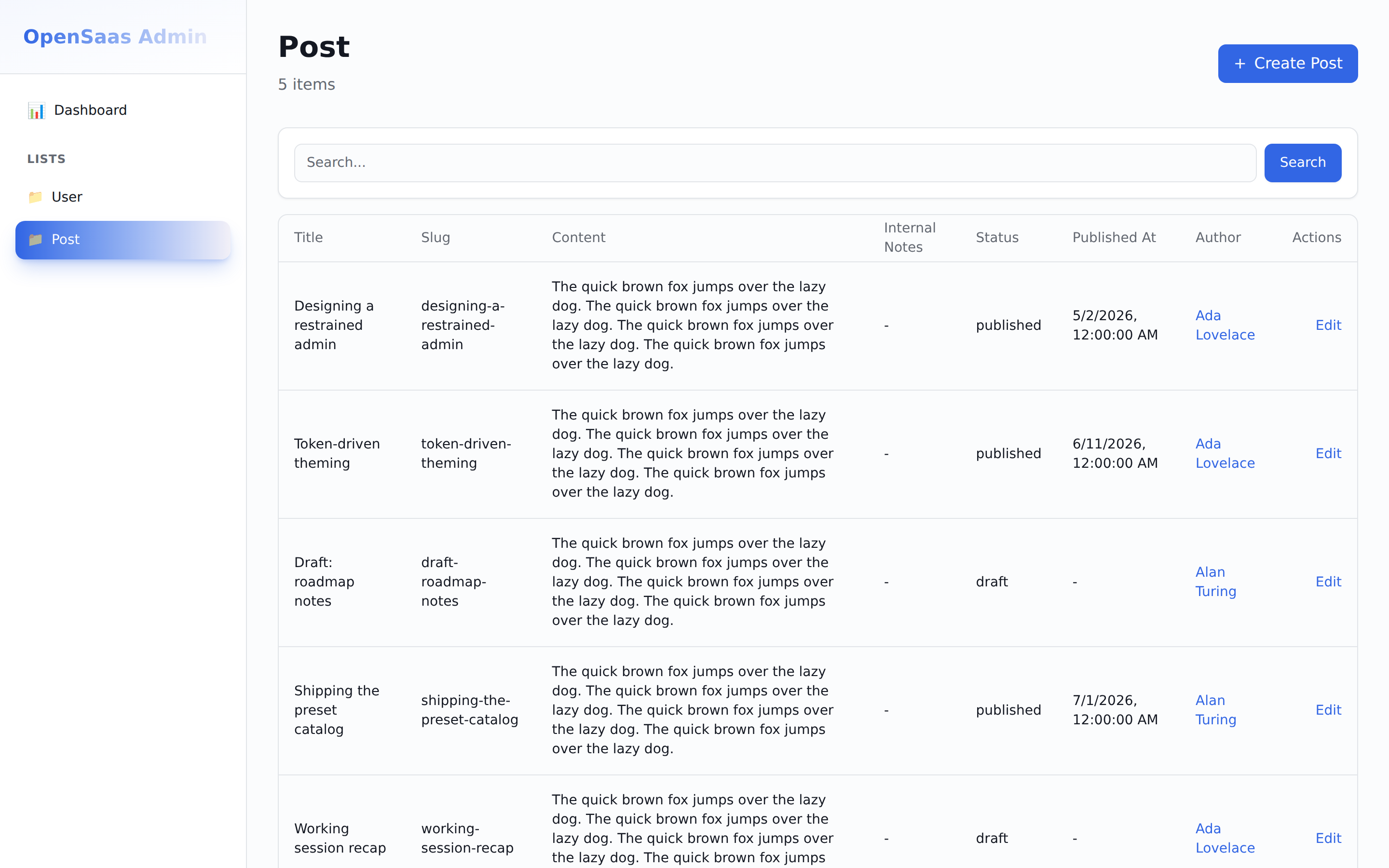
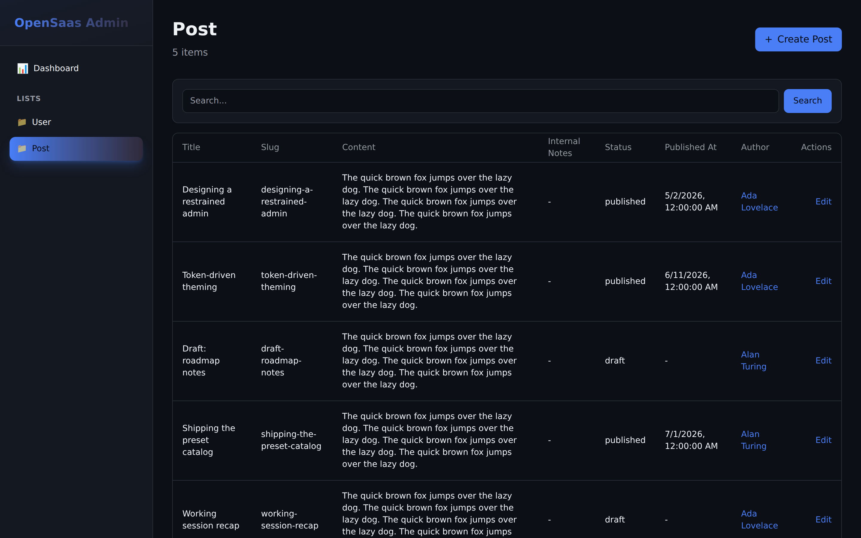
classic
Flat and enterprise-safe: a blue primary, squared-off corners (radius: 0.375), and elevation removed entirely (shadows set to none) so hierarchy comes from crisp borders alone. There is no gradient — both gradient stops collapse to the primary, rendering as a flat fill.
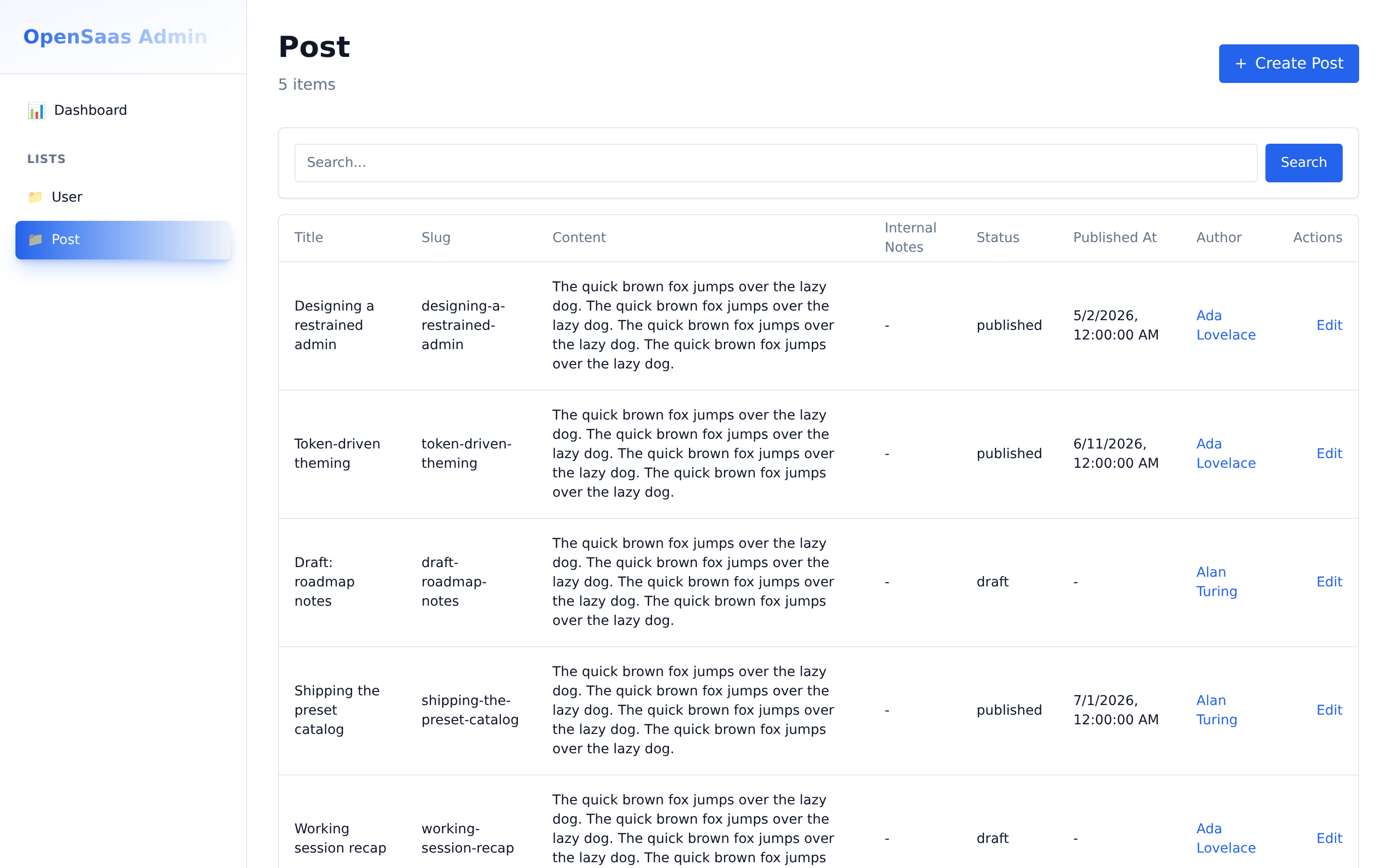
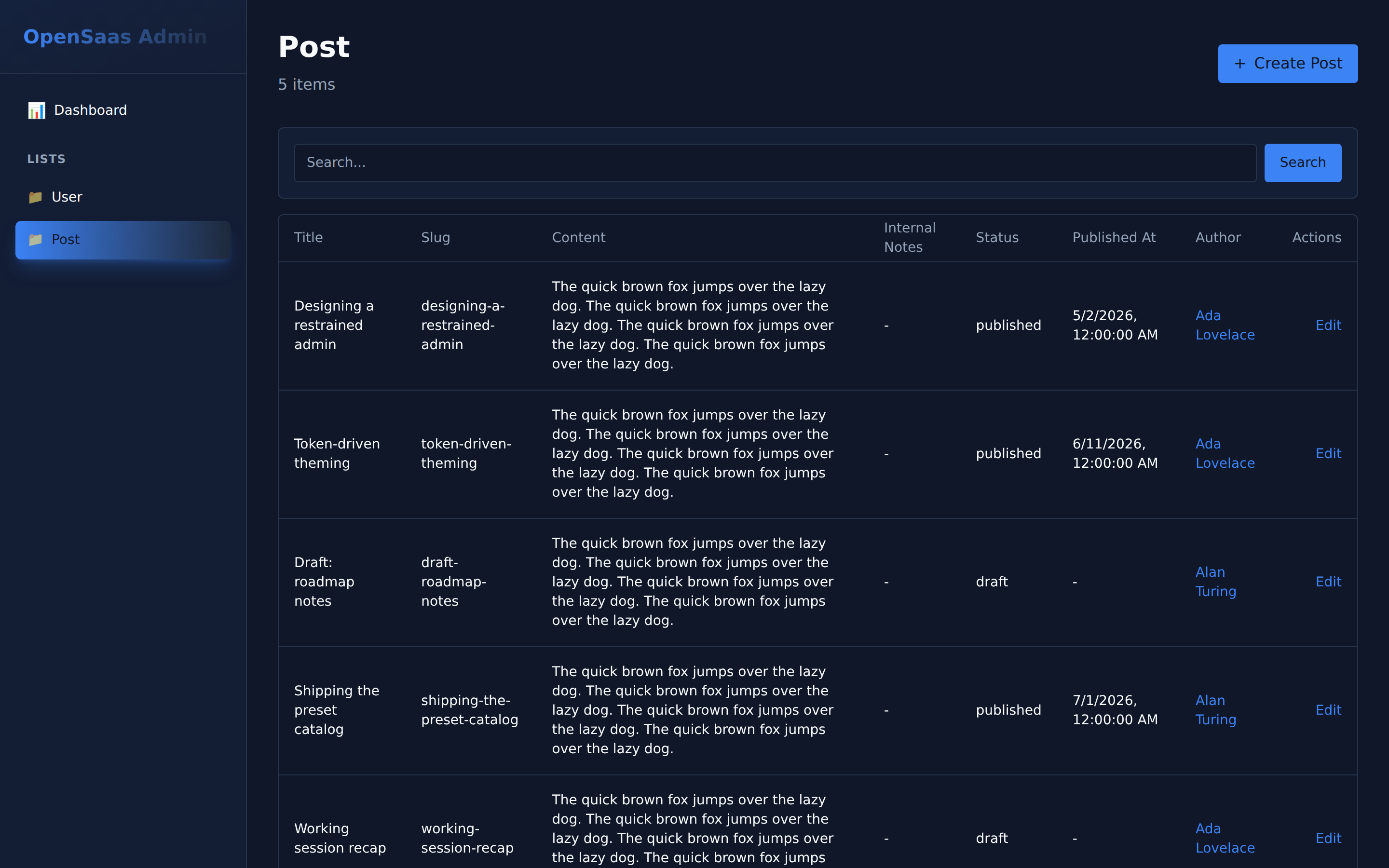
neon
The original high-chroma personality, preserved: a pink primary, purple accent, and a cyan → pink signature gradient that sweeps through purple. Rounder, playful corners (radius: 0.75) and the stylesheet's soft elevation.
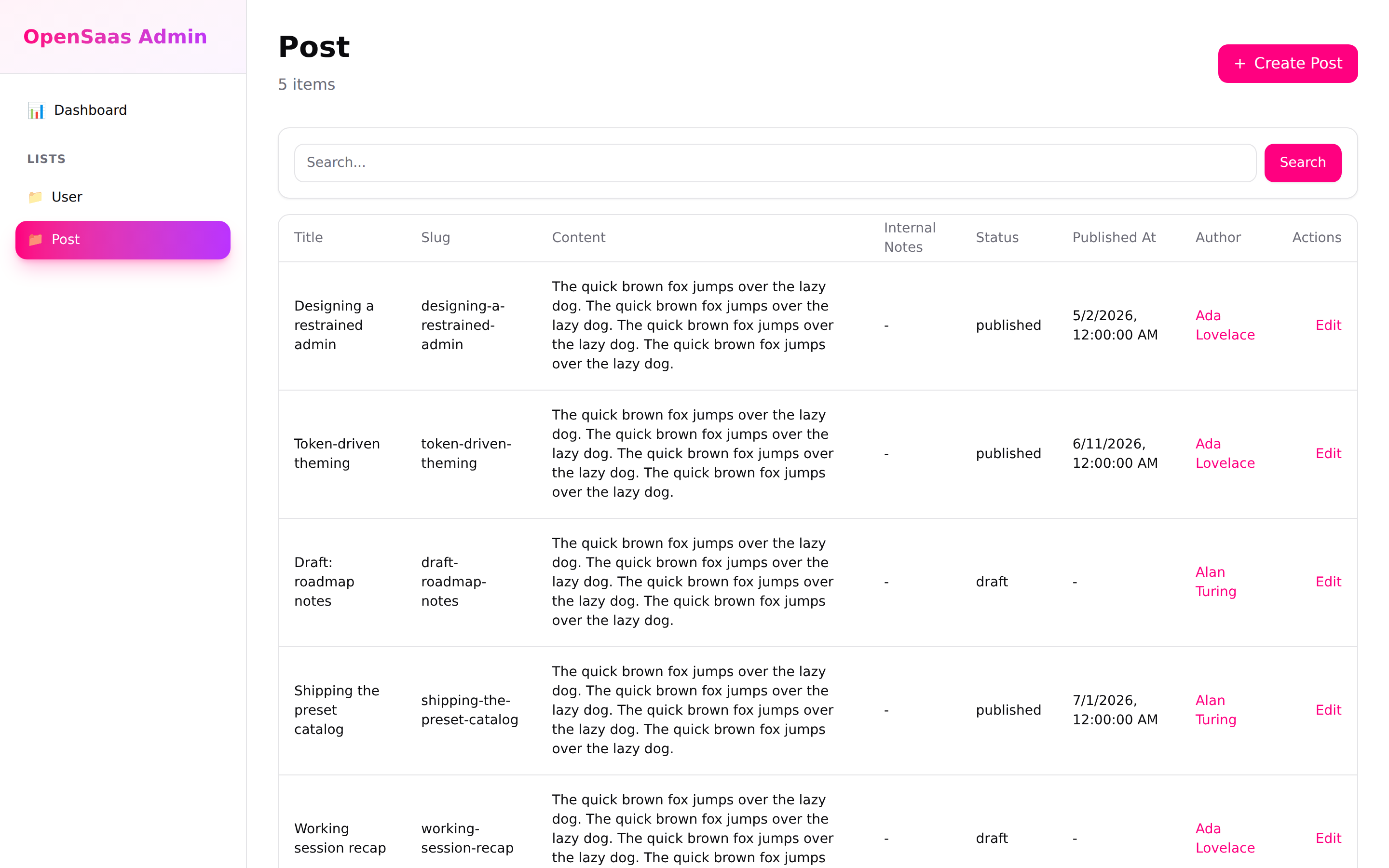
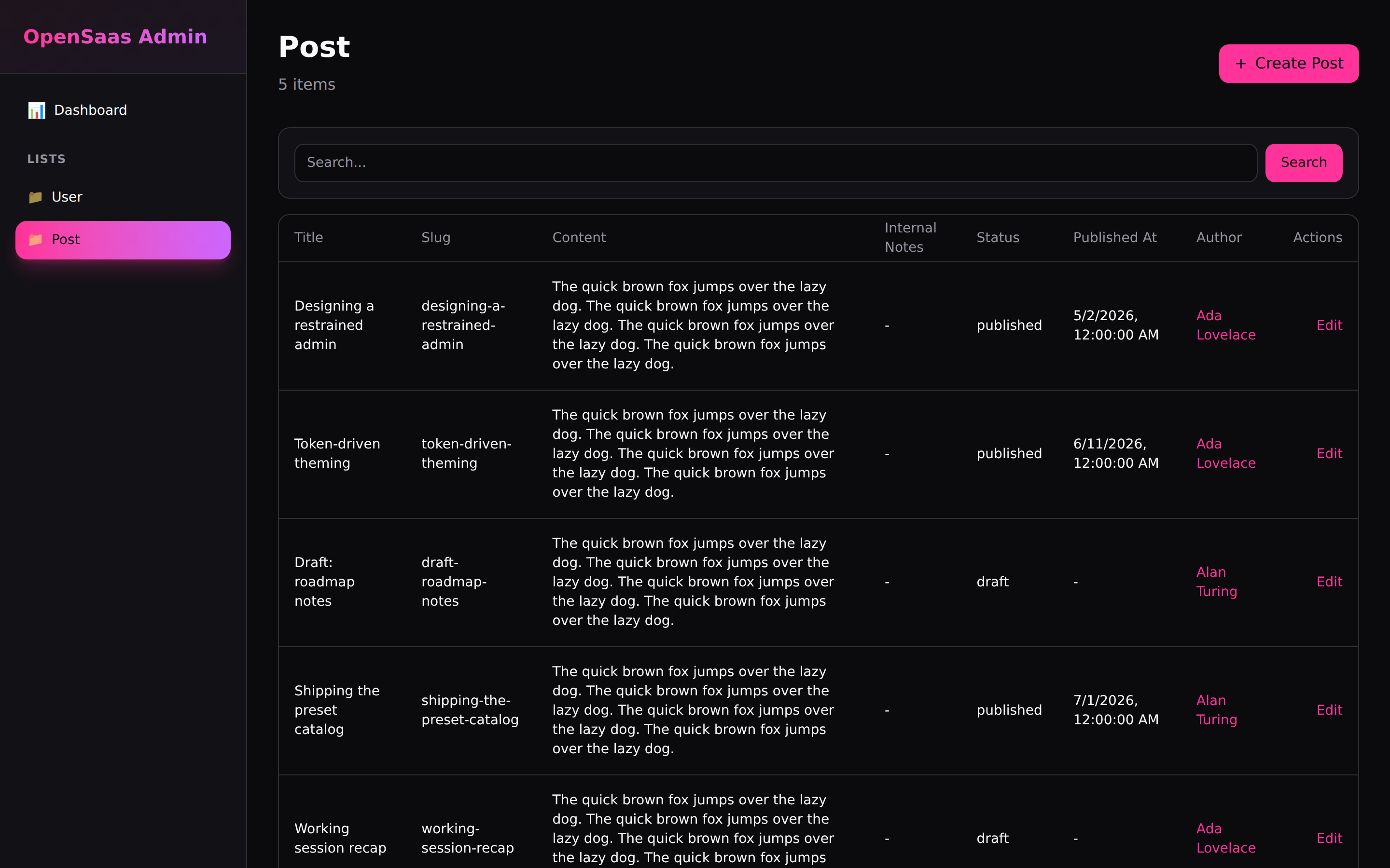
Choosing and customizing
| Preset | Character | Radius | Shadows |
|---|---|---|---|
modern | Restrained, low-chroma, one indigo brand accent | soft | soft |
classic | Flat enterprise blue, borders over elevation | squared | none |
neon | High-chroma cyan / purple / pink personality | round | soft |
Start from the preset closest to your product, then override individual tokens. For example, keep modern's restraint but swap in your brand colour:
// opensaas.config.ts
ui: {
  theme: {
    preset: 'modern',
    colors: { primary: '#0f766e', ring: '#0f766e' },
    darkColors: { primary: '#2dd4bf', ring: '#2dd4bf' },
  },
}
See the Theming guide for the full token vocabulary and override paths.