@opensaas/stack-ui
Composable React UI components for building admin interfaces with OpenSaas Stack. Built on top of shadcn/ui primitives with full TypeScript support and multiple levels of abstraction.
Overview
The UI package provides everything you need to build admin interfaces, from complete out-of-the-box solutions to low-level primitives for custom UIs:
- AdminUI - Complete admin interface with routing, navigation, and CRUD operations
- Standalone Components - Drop-in components for forms, tables, and common UI patterns
- Field Components - Individual field inputs with validation and type safety
- Primitives - Low-level shadcn/ui components for building custom interfaces
Installation
pnpm add @opensaas/stack-ui
The UI package has peer dependencies on @opensaas/stack-core, next, react, and react-dom.
Quick Start
Full Admin Interface
The simplest way to add an admin interface to your Next.js app:
// app/admin/[[...admin]]/page.tsx
import { AdminUI } from '@opensaas/stack-ui'
import { getAdminContext } from '@opensaas/stack-ui/server'
import config from '@/opensaas.config'
import '@opensaas/stack-ui/styles'

export default async function AdminPage() {
  const context = await getAdminContext()
  return <AdminUI context={context} config={config} />
}
This gives you a complete admin interface with:
- Dashboard with list summaries and quick actions
- List views with search, sorting, and pagination
- Create and edit forms with validation
- Delete confirmation dialogs
- Responsive navigation sidebar
Package Exports
The UI package uses multiple export paths for different levels of abstraction:
// Main export - Full admin UI and utilities
import { AdminUI, registerFieldComponent } from '@opensaas/stack-ui'

// Primitives - shadcn/ui components
import { Button, Card, Input, Table } from '@opensaas/stack-ui/primitives'

// Field components - Individual field inputs
import { TextField, SelectField, RelationshipField } from '@opensaas/stack-ui/fields'

// Standalone components - Composable CRUD components
import { ItemCreateForm, ItemEditForm, ListTable } from '@opensaas/stack-ui/standalone'

// Server utilities - Context and session management
import { getAdminContext } from '@opensaas/stack-ui/server'

// Styles - Tailwind CSS
import '@opensaas/stack-ui/styles'
Core Components
AdminUI
The AdminUI component provides a complete admin interface with routing, navigation, and CRUD operations.
import { AdminUI } from '@opensaas/stack-ui'
import { getAdminContext } from '@opensaas/stack-ui/server'
import config from '@/opensaas.config'

export default async function AdminPage() {
  const context = await getAdminContext()
  return <AdminUI context={context} config={config} />
}
Props:
context- Admin context with session and database accessconfig- OpenSaas configuration object
Features:
- Automatic routing based on URL segments
- Navigation sidebar with list links
- Dashboard with list summaries
- List views with search and sorting
- Create and edit forms
- Delete confirmations
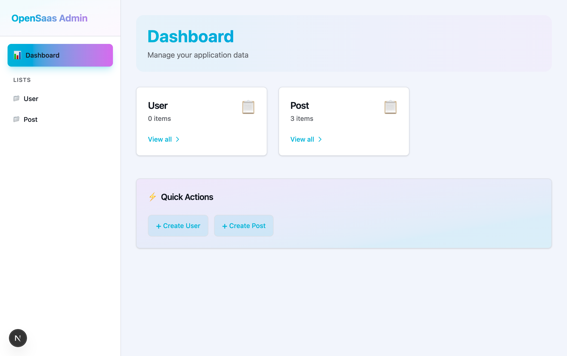
Dashboard
The dashboard shows an overview of your lists with item counts and quick actions.
Features:
- List summary cards with item counts
- "View all" links to list views
- Quick action buttons for creating items
- Responsive grid layout
ListView
The list view displays items in a table with search, sorting, and actions.
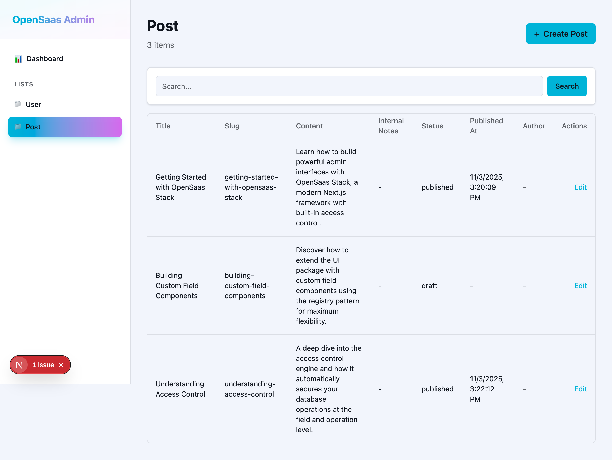
Features:
- Sortable columns
- Search functionality
- Edit and delete actions
- Pagination (coming soon)
- Responsive table layout
ItemForm
Forms for creating and editing items with validation and field-level access control.
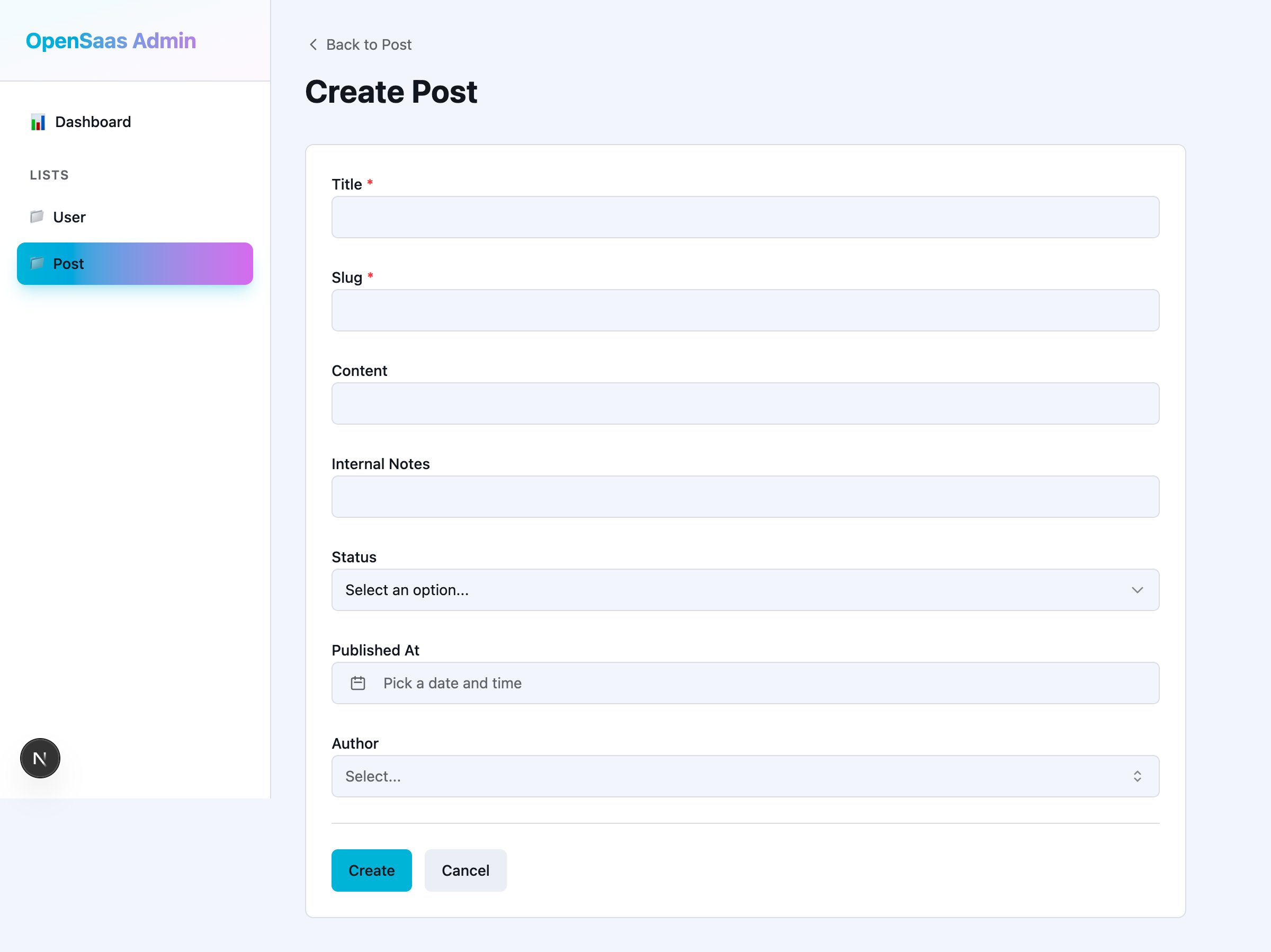
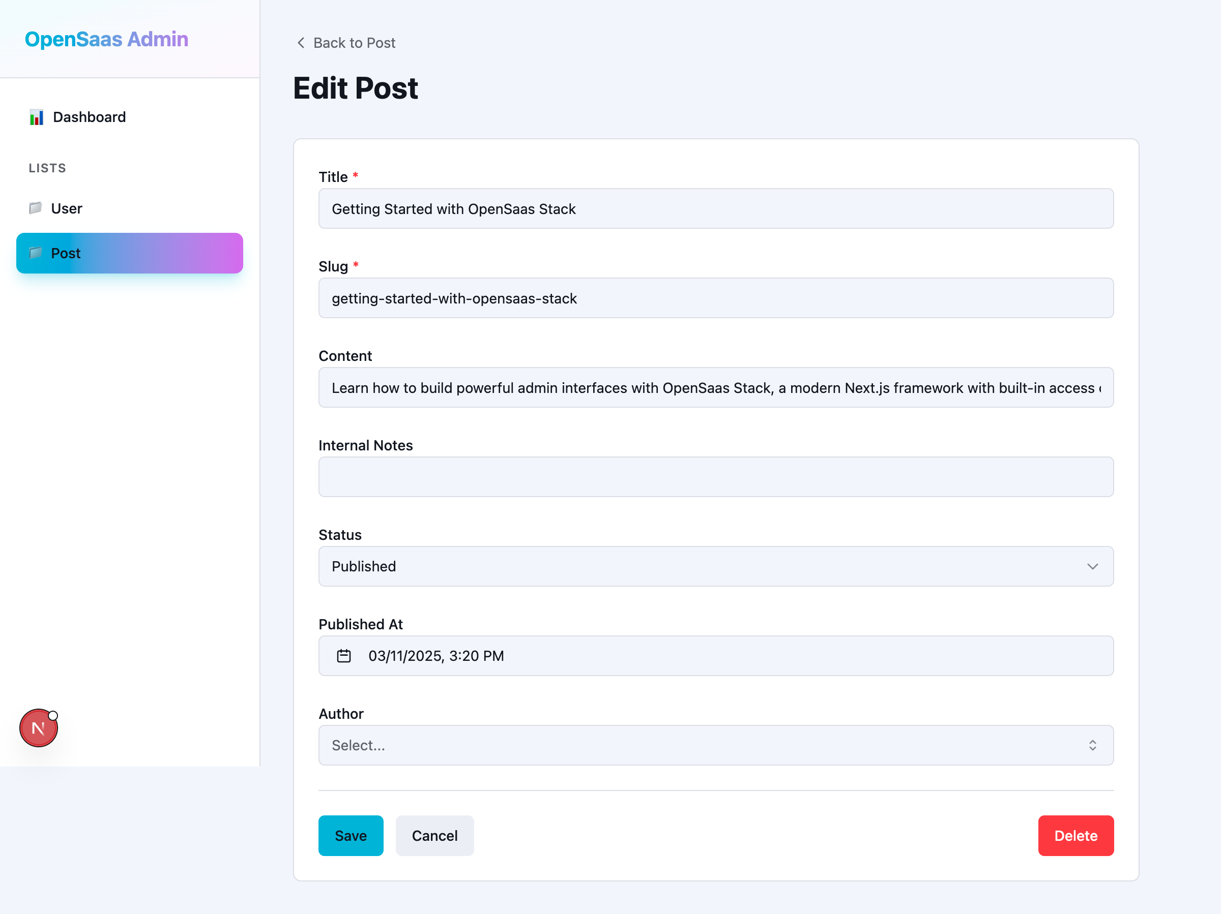
Features:
- Automatic field rendering based on field type
- Client-side and server-side validation
- Field-level access control
- Required field indicators
- Error messages
- Cancel and delete actions
Standalone Components
Standalone components allow you to build custom admin interfaces by composing individual components.
ItemCreateForm
A standalone form for creating new items.
import { ItemCreateForm } from '@opensaas/stack-ui/standalone'
import { getAdminContext } from '@opensaas/stack-ui/server'

export default async function CreatePostPage() {
  const context = await getAdminContext()

  return (
    <ItemCreateForm
      listKey="Post"
      context={context}
      onSuccess={(item) => {
        // Redirect or show success message
        console.log('Created item:', item.id)
      }}
      onError={(error) => {
        // Handle error
        console.error('Failed to create:', error)
      }}
    />
  )
}
Props:
listKey- The name of the list (e.g., "Post", "User")context- Admin context with session and database accessonSuccess?- Optional callback when item is created successfullyonError?- Optional callback when creation fails
ItemEditForm
A standalone form for editing existing items.
import { ItemEditForm } from '@opensaas/stack-ui/standalone'
import { getAdminContext } from '@opensaas/stack-ui/server'

export default async function EditPostPage({ params }: { params: { id: string } }) {
  const context = await getAdminContext()

  return (
    <ItemEditForm
      listKey="Post"
      itemId={params.id}
      context={context}
      onSuccess={(item) => {
        console.log('Updated item:', item.id)
      }}
      onError={(error) => {
        console.error('Failed to update:', error)
      }}
    />
  )
}
Props:
listKey- The name of the listitemId- The ID of the item to editcontext- Admin contextonSuccess?- Optional callback when item is updated successfullyonError?- Optional callback when update fails
ListTable
A standalone table component for displaying lists of items.
import { ListTable } from '@opensaas/stack-ui/standalone'
import { getAdminContext } from '@opensaas/stack-ui/server'

export default async function PostsPage() {
  const context = await getAdminContext()

  return (
    <div>
      <h1>Posts</h1>
      <ListTable
        listKey="Post"
        context={context}
        columns={['title', 'status', 'author', 'createdAt']}
      />
    </div>
  )
}
Props:
listKey- The name of the listcontext- Admin contextcolumns?- Optional array of field names to display (defaults to all fields)
SearchBar
A search input with button for filtering list views.
import { SearchBar } from '@opensaas/stack-ui/standalone'

export default function SearchPage() {
  return (
    <SearchBar
      placeholder="Search posts..."
      onSearch={(query) => {
        console.log('Searching for:', query)
      }}
    />
  )
}
Props:
placeholder?- Placeholder text for the search inputonSearch- Callback function when search is submitted
DeleteButton
A button with confirmation dialog for deleting items.
import { DeleteButton } from '@opensaas/stack-ui/standalone'

export default function ItemActions({ itemId }: { itemId: string }) {
  return (
    <DeleteButton
      listKey="Post"
      itemId={itemId}
      onSuccess={() => {
        console.log('Item deleted')
      }}
      onError={(error) => {
        console.error('Failed to delete:', error)
      }}
    />
  )
}
Props:
listKey- The name of the listitemId- The ID of the item to deleteonSuccess?- Optional callback when item is deleted successfullyonError?- Optional callback when deletion fails
Field Components
Field components are used internally by forms but can also be used directly for custom UIs.
Available Field Components
TextField- Text input for string fieldsIntegerField- Number input for integer fieldsCheckboxField- Checkbox for boolean fieldsSelectField- Dropdown for enum fieldsTimestampField- Date/time picker for timestamp fieldsPasswordField- Password input (hidden by default)RelationshipField- Combobox for relationship fields
Field Component Props
All field components share a common set of props:
interface FieldComponentProps {
  name: string
  value: any
  onChange: (value: any) => void
  label: string
  error?: string
  disabled?: boolean
  required?: boolean
  mode?: 'read' | 'edit'
  // Additional props from field.ui options
}
Example Usage
import { TextField, SelectField } from '@opensaas/stack-ui/fields'
import { useState } from 'react'

export default function CustomForm() {
  const [title, setTitle] = useState('')
  const [status, setStatus] = useState('draft')

  return (
    <form>
      <TextField
        name="title"
        value={title}
        onChange={setTitle}
        label="Title"
        required
      />

      <SelectField
        name="status"
        value={status}
        onChange={setStatus}
        label="Status"
        options={[
          { label: 'Draft', value: 'draft' },
          { label: 'Published', value: 'published' },
        ]}
      />
    </form>
  )
}
Primitives
Low-level shadcn/ui components for building custom interfaces.
Available Primitives
Form Controls:
Input- Text inputTextarea- Multi-line text inputLabel- Form labelButton- Button componentCheckbox- Checkbox inputSelect- Dropdown select with full component set (SelectTrigger, SelectContent, SelectItem, etc.)Combobox- Searchable select with autocomplete
Layout:
Card,CardHeader,CardContent,CardFooter- Card componentsDialog,DialogContent,DialogHeader,DialogFooter- Modal dialogsPopover,PopoverTrigger,PopoverContent- Popover components
Data Display:
Table,TableHeader,TableBody,TableRow,TableCell- Table components
Date/Time:
Calendar- Calendar componentTimePicker- Time picker componentDateTimePicker- Combined date and time picker
Example Usage
import { Card, CardHeader, CardContent, Button, Input } from '@opensaas/stack-ui/primitives'

export default function CustomCard() {
  return (
    <Card>
      <CardHeader>
        <h2>Custom Form</h2>
      </CardHeader>
      <CardContent>
        <Input placeholder="Enter text..." />
        <Button>Submit</Button>
      </CardContent>
    </Card>
  )
}
Customizing Field Components
The UI package uses a component registry pattern that allows you to customize how fields are rendered.
Global Registration
Register a component globally to use it across multiple fields:
// lib/register-fields.ts
'use client'

import { registerFieldComponent } from '@opensaas/stack-ui'
import { ColorPickerField } from './components/ColorPickerField'

registerFieldComponent('color', ColorPickerField)
Then use it in your config:
// opensaas.config.ts
import { config, list, text } from '@opensaas/stack-core'

export default config({
  lists: {
    Theme: list({
      fields: {
        primaryColor: text({ ui: { fieldType: 'color' } }),
        secondaryColor: text({ ui: { fieldType: 'color' } }),
      },
    }),
  },
})
Per-Field Override
Pass a component directly for one-off customization:
// opensaas.config.ts
import { SlugField } from './components/SlugField'

export default config({
  lists: {
    Post: list({
      fields: {
        slug: text({ ui: { component: SlugField } }),
      },
    }),
  },
})
Component Resolution Priority
The FieldRenderer resolves components in the following order:
field.ui.component- Per-field override (highest priority)field.ui.fieldType- Global registry lookup by custom typefield.type- Default registry lookup by field type
Server Utilities
getAdminContext
Get an admin context with session from request headers.
import { getAdminContext } from '@opensaas/stack-ui/server'

export default async function AdminPage() {
  const context = await getAdminContext()
  // context includes session if using @opensaas/stack-auth
  return <AdminUI context={context} config={config} />
}
Styling
The UI package includes Tailwind CSS v4 styles. Import them in your root layout:
// app/layout.tsx
import '@opensaas/stack-ui/styles'

export default function RootLayout({ children }) {
  return (
    <html>
      <body>{children}</body>
    </html>
  )
}
Custom Theming
The UI package uses CSS variables for theming (following shadcn/ui conventions):
/* app/globals.css */
@layer base {
  :root {
    --background: 0 0% 100%;
    --foreground: 222.2 84% 4.9%;
    --primary: 221.2 83.2% 53.3%;
    /* ... other variables */
  }

  .dark {
    --background: 222.2 84% 4.9%;
    --foreground: 210 40% 98%;
    /* ... other variables */
  }
}
Type Safety
All components are fully typed with TypeScript:
- Context types are inferred from your Prisma client
- Field props are typed based on field config
- Form data is validated with react-hook-form + Zod
Performance
The UI package is optimized for performance:
- Server components by default (AdminUI, getAdminContext)
- Client components only where needed (forms, interactive elements)
- Minimal client-side JavaScript
- Data fetching on the server reduces bundle size
Examples
Custom Dashboard
Build a custom dashboard using standalone components:
import { ListTable, ItemCreateForm } from '@opensaas/stack-ui/standalone'
import { Card, CardHeader, CardContent } from '@opensaas/stack-ui/primitives'
import { getAdminContext } from '@opensaas/stack-ui/server'

export default async function CustomDashboard() {
  const context = await getAdminContext()

  return (
    <div className="grid gap-4 p-4">
      <Card>
        <CardHeader>
          <h2>Recent Posts</h2>
        </CardHeader>
        <CardContent>
          <ListTable
            listKey="Post"
            context={context}
            columns={['title', 'status', 'createdAt']}
          />
        </CardContent>
      </Card>

      <Card>
        <CardHeader>
          <h2>Create New Post</h2>
        </CardHeader>
        <CardContent>
          <ItemCreateForm
            listKey="Post"
            context={context}
            onSuccess={(item) => {
              console.log('Created:', item.id)
            }}
          />
        </CardContent>
      </Card>
    </div>
  )
}
Custom Field Component
Create a custom field component:
// components/ColorPickerField.tsx
'use client'

import { useState } from 'react'
import type { FieldComponentProps } from '@opensaas/stack-ui/fields'

export function ColorPickerField({
  name,
  value,
  onChange,
  label,
  error,
  required,
}: FieldComponentProps) {
  return (
    <div>
      <label>
        {label}
        {required && <span className="text-red-500">*</span>}
      </label>
      <input
        type="color"
        name={name}
        value={value || '#000000'}
        onChange={(e) => onChange(e.target.value)}
      />
      {error && <p className="text-red-500">{error}</p>}
    </div>
  )
}
Then register it:
// lib/register-fields.ts
'use client'

import { registerFieldComponent } from '@opensaas/stack-ui'
import { ColorPickerField } from '@/components/ColorPickerField'

registerFieldComponent('color', ColorPickerField)
Related Packages
@opensaas/stack-core- Core configuration and access control@opensaas/stack-auth- Authentication with Better-auth@opensaas/stack-tiptap- Rich text editor field type
See Also
- Custom Field Example - Complete example of custom field components
- Composable Dashboard Example - Using standalone components
- Core Package Documentation - Config and field types